Photos are an opportunity to communicate with web visitors in ways other page elements can’t. They clarify information, support messages, aid reading, and tell the user something about the organization.
Get signed consent forms for all photos of a patient or their family members you want to publish. Be aware of patients who might be in the background of shots you take yourself, and protect the privacy rights of patients and families by adhering to university brand and style guidelines and health privacy laws.
Think Like an Outsider
A well-chosen photo can make users feel like they’re at a professional, trustworthy site that understands their needs and wants to help them accomplish what they came to do. The wrong photo can confuse or offend them, undermining our organization’s credibility.
Smile for the camera
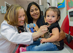 Avoid images where the subjects are looking directly into the lens. Save these for event coverage and advertisements. This shot looks too staged for a page that describes general pediatric services.
Pictures of people make services feel personal and inviting, but if big smiles would seem out of place in the situation pictured or if the subjects are unnaturally looking at the camera, they can come across too slick and contrived. Keep smiley marketing shots to high-level messaging content, and use more informative or contextual images on detail pages.
Editorial-style shots
 When no one is looking into the camera it tends to feel less intrusive. Viewers feel like they’re invited to witness an event, not interrupting.
Make a powerful statement
 You can use subjects looking into the lens when you want to highlight a particular person’s involvement. This one might be appropriate for a story about how researchers are actively engaged in a clinical trial program, but would be out of place on a page recruiting patients for clinical trials.
Consider the squeamish
 Showing this is a good way to make sure users run from your site screaming. Also avoid surgery photos unless they’re way down deep in the website, with technical content most patients and the general public wouldn’t casually stumble upon. Don’t show a patient who doesn’t look particularly alert. What the photographer saw as “successfully anesthetized” could be interpreted as “dead on the table” by someone already anxious about surgery.
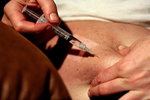
Lots of people are afraid of needles, and doctors in general make some nervous. Don’t use photos of threatening-looking instruments (unless you’re going to explain what they do) or photos that make clinics look cold and uninviting. And don’t depict anything breaking the skin barrier, unless you want users to pass out when the page loads. While sterile and shiny are essential qualities of a good medical practice, they don’t always make patients feel comfortable.
Provide Context
Don’t think of photos as decoration, think of them as having a job to do: to supplement the page content with additional detail or context. Can a photo add something to the copy on the page? Is there a description begging for an illustration? A concept that could be understood more easily with the addition of a picture?
 Photos should also be appropriate to the goals of that particular page. Marketing photos (soft light, bright colors, full-frame happy people looking into the camera) won’t look natural on a page about a serious medical condition. And you don’t want a gnarly image of advanced tissue damage welcoming users to the homepage (even if it’s relevant to the news story in the “most recent” featured slot). Match the style of the photo to the goals of the page content to keep everything relevant
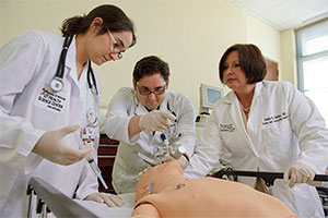
Information copy can’t convey
This image does a great job of showing what the classroom environment is like for dental students - it gives them an idea of equipment they’ll use and settings they’ll experience before clinical training.
Educate Users
One of our website design principles is to “make users feel smarter,” and the service descriptions and condition detail pages are a great place for that. Before and after photos tell a story about the effectiveness of your services, and juxtaposing healthy photos with affected ones can help a patient compare their own symptoms. It’s OK to illustrate disease in an educational context on these pages, but keep the “no needles and gore” rule in mind. If a depiction of the condition might be too much (or too hard to come by), try images that capture other aspects of the services you provide for these patients, or show successful results.
Communicating the science of medicine
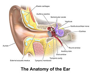 Illustrations are a good way to picture internal structures and conditions that might be disturbing to general users landing on your page from a search. Like medical terms in text, photos should introduce the user to unfamiliar concepts with plenty of explanation in the captions to provide context to non-medical professionals.